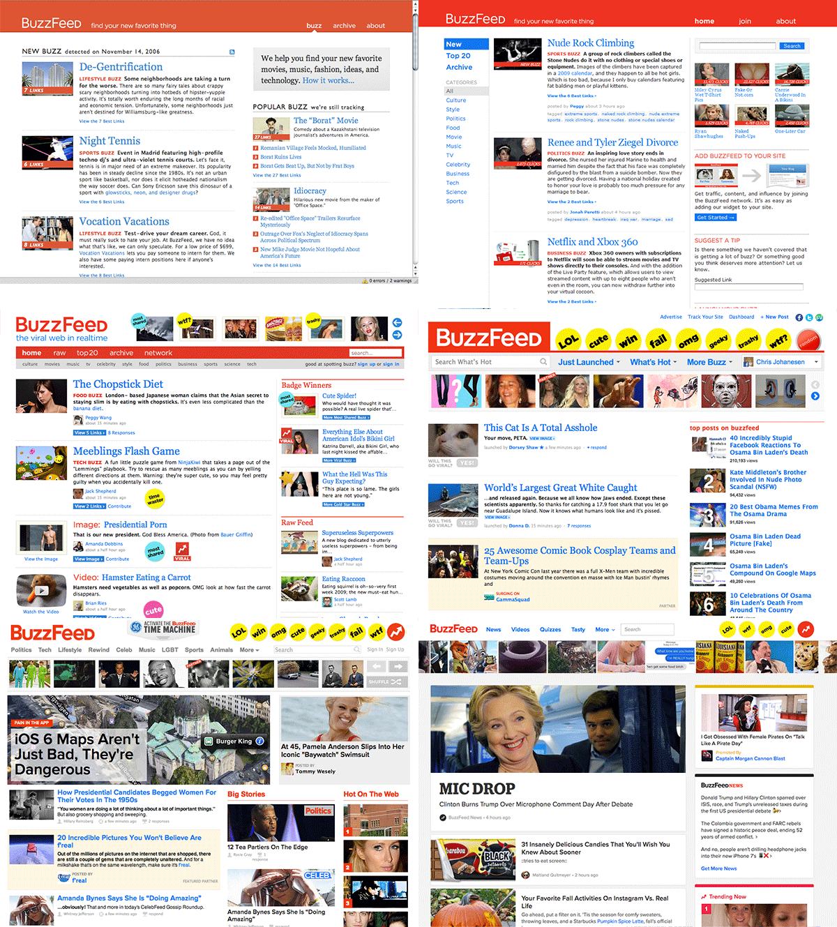
BuzzFeed is well-known in the media business for publishing stories wherever its audience is — on Facebook, Snapchat, Tumblr and many other places.
Given this emphasis, it might seem odd that BuzzFeed spent the last six months overhauling its homepage. But in an age where the bulk of readers are finding stories with social media and search engines, the homepage is still a vital part of news distribution, said Chris Johanesen, BuzzFeed’s vice president of product.
The new page, which launched today, is designed to be the hub of BuzzFeed’s sprawling storytelling empire, Johanesen said.
“Our distribution strategy has been about not trying to force everyone to come to our site. But we do have a fairly big audience that comes to BuzzFeed.com,” Johanesen said. “…We know that audience is highly engaged and shares a lot and consumes a lot of content. So we think that the BuzzFeed homepage can be the best version of BuzzFeed content and the center of our ecosystem.”
BuzzFeed’s homepage has existed in some form or another since the company launched a decade ago (with Johanesen as its third employee), but things were drastically different then, he said. Video hadn’t begun its ascendency. Social networks like Instagram and Pinterest hadn’t launched yet. Twitter hadn’t conquered the news cycle.
Although the web — and BuzzFeed — has changed dramatically in the intervening years, the viral news giant’s homepage hadn’t quite caught up, Johanesen said. There have been many updates since the site first launched, but additional innovations were still necessary.
Those include improved integration of video, more homepage play for images (think comics and illustrations) and increasingly nuanced ways to package big stories.
Another improvement: Before the redesign, BuzzFeed had separate sites for mobile and desktop viewers. Going forward, that will change, Johanesen said.
“We have a lot more editors and content creators creating comics and illustrations and little meme-y things that we want to be able to flow in between stories and quizzes and news items,” Johanesen said. “And it didn’t feel like our current page really set us up for that, whereas a feed with different types of media in it could represent everything that BuzzFeed was doing in a very flexible way.”
The new homepage must also pull double duty as an entry point for BuzzFeed’s two biggest divisions, BuzzFeed News and BuzzFeed Entertainment Group. It could prove a tricky task, given public rumblings of internal tension between the company’s news and entertainment groups. But Johanesen says the new homepage will feature the same proportion of news stories as its predecessor and that higher-ups at both divisions have users’ best interests at heart.
Meanwhile, BuzzFeed News will continue to have its own homepage, and a revamped video page will showcase content from across the company.
“I think everyone at the company is aligned around having a good mix and letting our homepage serve all those purposes,” Johanesen said. “which I think is something that sets us apart from other sites.”
Although the majority of BuzzFeed’s interactions with users happen off site (a company spokesperson estimated about 20 percent of its content views occur on owned and operated platforms like BuzzFeed.com), the homepage is still important, Johanesen said. For one thing, it can serve a jumping-off point for content with the potential to go viral. It’s also a base for BuzzFeed’s power users, who return to the homepage throughout the day to see what’s new.
Before today’s launch, BuzzFeed spent half a year testing the site in public, said Allison Chefec, a product designer. The company began by stripping away much of the existing homepage features and adding them back in based on feedback from readers.
The results? Page load time is down, and BuzzFeed has a homepage somewhat reminiscent of vertical social media feeds like Facebook and Twitter. Along the way, the company developed a new, open-source CSS that has already spread to other pages. Another focus was removing clutter to make BuzzFeed content stand out, Chefec said.
“After all, that’s why our readers come to our homepage,” she said.
BuzzFeed now has a homepage for 2016. But if experience is a guide, additional tweaking will undoubtedly follow.
“We’re not trying to get everyone in the world to only consume content on our homepage,” Johanesen said, “but we think we can offer that as the best version of our site.”

The evolution of BuzzFeed’s homepage, from 2006 to today.
Correction: A previous version of this story misspelled Chris Johanesen’s surname.


