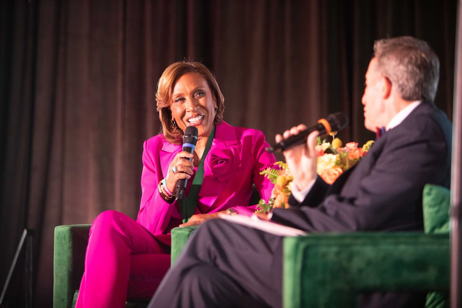
Regardless of the size of your newsroom, managing design and other visual elements can be a challenge. Many leaders from small and large organizations attending Poynter’s Visual Leadership Issues Conference shared such challenges as supervising copy editors who are insufficiently trained in typography; mediating disputes about which typeface or color to use; and puzzling over when, or whether, to silhouette a photographic image, or place type on a photo.
These conversations can be hard to mediate, especially since skill levels and motivations vary so much across departmental lines. The following are a few fundamental guidelines that can help art directors, design directors and graphics editors manage the visuals in their paper and coach their staffs in a more focused way.
1) Have a stylebook, with a grid and a palette for fonts and colors, and a photo ethics and manipulation policy. Use it. Enforce it. It sounds basic, but without these boundaries, you¹ll usually have chaos.
2) Recognize that not everyone has the skill set to do the jobs we ask them to do. For example, few journalists are trained in the fundamentals of how type works, or color theory, or grid systems — basics for the layout jobs that many editors are asked to do. We as newsroom leaders have to either provide this training or establish a strict framework in which to work.
3) Give everyone’s work a (qualified) second eye, while in progress. Before publication, not after, is the time to provide feedback. Just as the city hall reporter has the city editor “read back” on her interview with the mayor before publication, so the designer of the metro front should have a qualified supervisor review his layout before production.
4) Don’t waste time critiquing production (should I use a 1-point rule or hairline box around a photo?). Critique creativity and content instead (was this photo the right choice? is the crop appropriate? does the headline go with the visual?).
5) Banish phrases from your critique sessions such as “I like it,” “I don’t like it,” and “I don’t know why, it just works for me.” Without articulation, these defenses are useless. Staffers and supervisors alike should be expected to justify why they’ve taken a certain approach.
6) Create and publicize within the staff an understanding about what your paper values in terms of design. Refer back to those standards when reviewing work. (A paper like The New York Times values things like consistency and clarity, while the National Enquirer may value surprise and shock value. These values are directly reflected in the look of each publication.)
7) Create a “learning newsroom.” Acknowledge that, while everyone has learning to do, everyone has the potential to teach as well. We grow as we learn.


