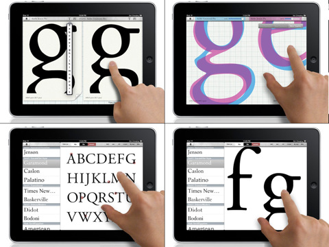
By creating contrast in your design, you guide your audience through the content of your page. One way to create contrast is with type elements. Here are some guidelines for using typography.
- Try to limit yourself to two typefaces on a publication. Then limit yourself to two weights of each face. Adding italic versions of each weight gives you eight typographic choices—enough to relate any message.
- You can also consider these variables within the typefaces: size, color, format, character shape, character width, position on the page, weight, stress and density.
- Be obvious. If two pieces of type are set with only minor differences, (similar typefaces, similar size) the result might seem like a mistake or a near miss.
Taken from Typography for News Design, a self-directed course with Sara Quinn at Poynter NewsU.
Have you missed a Coffee Break Course? Here’s our complete lineup. Or follow along on Twitter at #coffeebreakcourse.


