A single image — a woman grieving over her husband’s body shrouded in a white sheet.
A headline or just one word (or a very few) — “Heartbreaking.” “No Mercy.” “UnGodly.” “Help Us, Please.”
They capture the destruction and desperation caused by one of the worst natural disasters in U.S. history. For purposes of gripping readers and engaging them in your coverage, nothing else need be said.
Wall-to-wall coverage of stories such as Katrina or Sept. 11 provide the opportunity to simplify and get out of the way. People need information delivered in its most basic form.
As someone who once lived in the region, I think about the information needs of people with loved ones in Louisana. Number one question: “Are they okay?” Followed by: “How can I help?” “What do you need? “How can I help other victims?”
The need to simplify becomes even more urgent in the areas directly affected by Katrina.
Deliver the essential information to victims who are in desperate need and have no means of communication. Design matters little except in its simplicity.
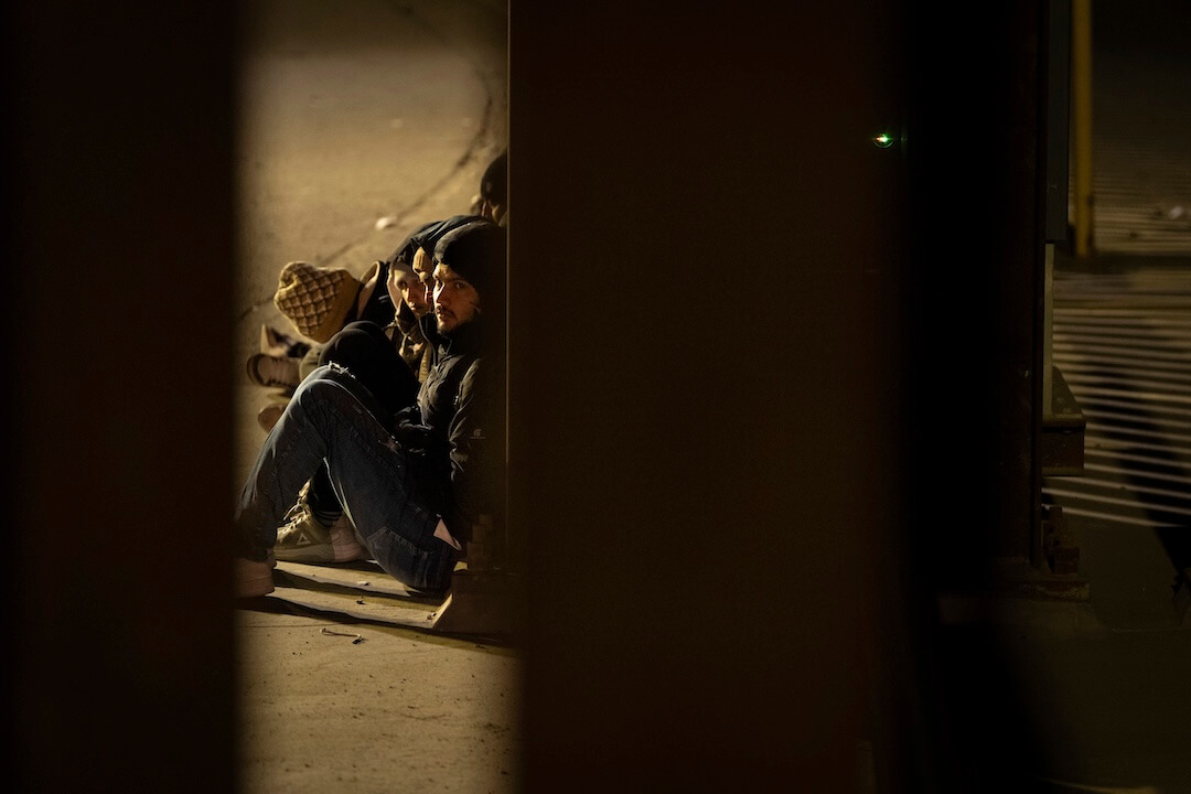
One image can transport the reader to a deeper level of understanding of the story.
One word can focus the feeling of a nation.
A single image A single wordMore Front Pages:
VisualEditors.com
On the Web:
The Sun Herald in Biloxi


