Poynter’s “EyeTrack: Tablet” project, the latest in our long tradition of research to understand how readers view news, can now announce some early results: iPad users have an overwhelming instinct to swipe horizontally through a full screen photo gallery, regardless of portrait or landscape orientation.
Our Poynter research team thought this was the case. But we couldn’t say with any certainty until we’d observed about a hundred people in an initial, small slice of the study at multiple sites around the U.S.
This first bit of data helps us make decisions about the much more complex prototype designs that we’ll test in the months ahead.
The swiping gesture is an important component to integrate. Much news content on tablets currently call for users to swipe horizontally between stories and vertically through the actual text of a story. But most photo galleries move horizontally through a single story or topic. This finding supports that approach to photo galleries.
In our test, each subject was handed an iPad in a scientifically randomized orientation — portrait or landscape — to look through three photo galleries. They were asked not to turn the tablet after it was handed to them. Participants who were given an iPad in landscape orientation swiped horizontally 93% of the time. In portrait, they swiped horizontally 82% of the time. This is statistically significant (p<0.001) evidence for a horizontal inclination and indicates that the swipe direction isn’t just a random behavior.
So that we can release findings as we go, we’re initially testing small elements of behavior like this, one at a time.
Breaking the research into smaller questions “allows more faculty, researchers and students to get involved,” said Jeremy Gilbert, assistant professor of media product design at Northwestern’s Medill School of Journalism. Medill students are conducting part of this early testing. About one-third of participants are in Evanston, Ill., while about one-third of the other subjects are being observed at the University of Florida; and one-third in St. Petersburg, Fla., at Poynter. Soon, participants will be observed in Denmark as well.
The process is painstaking, but it’s better to get specific information sooner, rather than later. We’re basing designs on research, in addition to close observation of what is currently being tried within the media world.
“This lower-cost usability testing is quicker to conduct but can still draw meaningful, methodologically sound conclusions,” said Gilbert. “And it can have impact much more quickly than previous projects.”
-

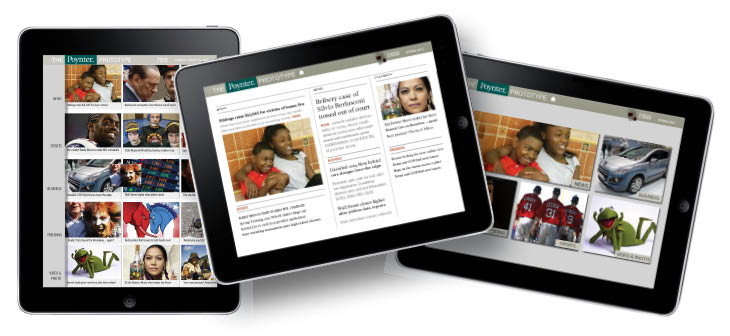
- The major prototypes in Poynter’s EyeTrack: Tablet project include three styles of entry pages. Development is underway. The project is funded largely by the Knight Foundation.
You can see a few work-in-progress designs above. In a few weeks, the team will begin to use eyetracking gear to see how people use three different tablet entryways and a variety of subsequent story and advertising forms.
The possible variables are endless, but Poynter is working to focus on key issues that can be tested most effectively. In addition to eyetracking equipment, we’re using observational analysis, survey and exit interviews.
Gilbert is part of the core research team with David Stanton of Smart Media Creative; Mario Garcia, founder of Garcia Media and key designer of tablet and media projects; and myself. We also have a long list of stellar advisers from within Poynter and around the world.
And here’s a way you can help: We’re currently looking for 20-30 great stories with strong “shelf life” to be included in the prototype testing. The stories should exemplify storytelling in a variety of forms for tablet — written, video, photo and both static and interactive graphics. If you’d like to suggest a story or project now, please let me know. We need stories about sports, business, global news, science, popular culture, and more.
You can read more about the project and how to get involved on the Poynter “EyeTrack: Tablet” Facebook page and in The Mario Blog.
To hear more detailed discussion about the instinctive swipe direction on tablets, listen to the ViewSource podcast on Monday.


Comments