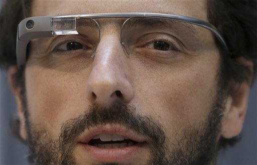
Google Glass, a pair of wearable computer-enhanced eyeglasses, is possibly the next-big-thing in mobile computing.

- Google co-founder Sergey Brin wears Google Glass glasses at an event in San Francisco in February. (AP Photo/Jeff Chiu)
About 8,000 developers have prototypes, and the public is expected to be able to buy them soon. Early reviews are a mix of awesome and awkward — life-changing technology held back only by concerns about privacy and aesthetics.
We’ve been expecting this evolution since at least 2011, when Poynter friends and former fellows Matt Thompson and Robin Sloan created a futuristic video called “The Storm Collection” depicting a future where “photo frames, windshields and eyeglasses become heads-up-displays for information. Call them NUDs: news-up-displays.”
It’s here.
How it works
Users can control the glasses through voice commands or a small touch-sensitive pad on the side of the temple. Head movements can also play a role, such as tilting your head up slightly to activate the screen.
Each chunk of incoming information (text, images, video, etc.) is presented in the upper-right corner of the user’s field of vision on a little bubble called a “timeline card.” The user sees one card at a time (the most recent one), and can swipe backward and forward through the timeline to see other cards.
Glass also has a small speaker near the user’s ear that can read text aloud or play sounds at a volume just loud enough for the individual to hear.
How to build for it
Googler Timothy Jordan gave a crowd at South by Southwest a tour of how the smartglasses work, and how developers should think about building apps for them. (Engadget has some pictures.)
The early examples include a New York Times-developed app that pulls in popular headlines and photos.
TechCrunch writer Frederic Lardinois relays Google’s guidance:
Google is setting a few rules for Glass apps. They shouldn’t, for example, show full news stories but only headlines, as everything else would be too distracting. For longer stories, developers can always just use Glass to read text to users.
… The New York Times app, for example, shows headlines and then lets you listen to a summary of the article by telling Glass to “read aloud.”
There is no unique user interface for individual Glass apps. You won’t be designing backgrounds, buttons or menus. Glass is really designed to just simply receive pieces of information from apps, through an API.
It’s early still, but there are at least a couple things news organizations can start planning for right now to take advantage of this technology.
You must have a content API. A simple XML feed might have been fine to put browsable lists of recent headlines in your news organization’s smartphone app. But in this new world the content itself, not the package, is the product. You’re going to need an API capable of taking external requests and returning relevant content.
Think passive content. Like Jordan said, Glass isn’t going to be a great tool for reading long passages of text. That requires too much active visual focus and manual scrolling — if I want to do that, I’ll pull out a smartphone or tablet.
Glass seems much better suited for passively engaging media, like video or audio. Imagine the experience of watching and hearing CNN in a little box for a few minutes while walking down the street and seeing where you’re going. Or listening to an NPR program on the personal speaker while grocery shopping. Media that doesn’t take all your attention off the surrounding world will be well-suited for Glass users.
Design for real-world context. Designing information delivery for specific situations will be a big new challenge for Google Glass development.
It’s quite different than designing apps for smartphone users, who are conditioned to enter “the mobile bubble” each time they engage with the device — Stop. Pull out phone. Tap. Read. Close. Sleep. Put phone away. Return to real world.
Glass users will continue to see and engage seamlessly in the real world around them. There’s no bubble. That means they will want information that is immediately relevant and useful to what’s happening in the real world around them, right now.
News organizations will have to think intensely about how they can provide utility through these new apps. The challenge will be to learn a new way of thinking — as a service-providing technology company, not simply an article-producing media publisher.
Correction: An earlier version of this story incorrectly stated that Google built the New York Times app. We updated the piece after learning that the Times story we had originally quoted from was incorrect. Also, the app lets you listen to summaries of articles, not full articles.


Comments