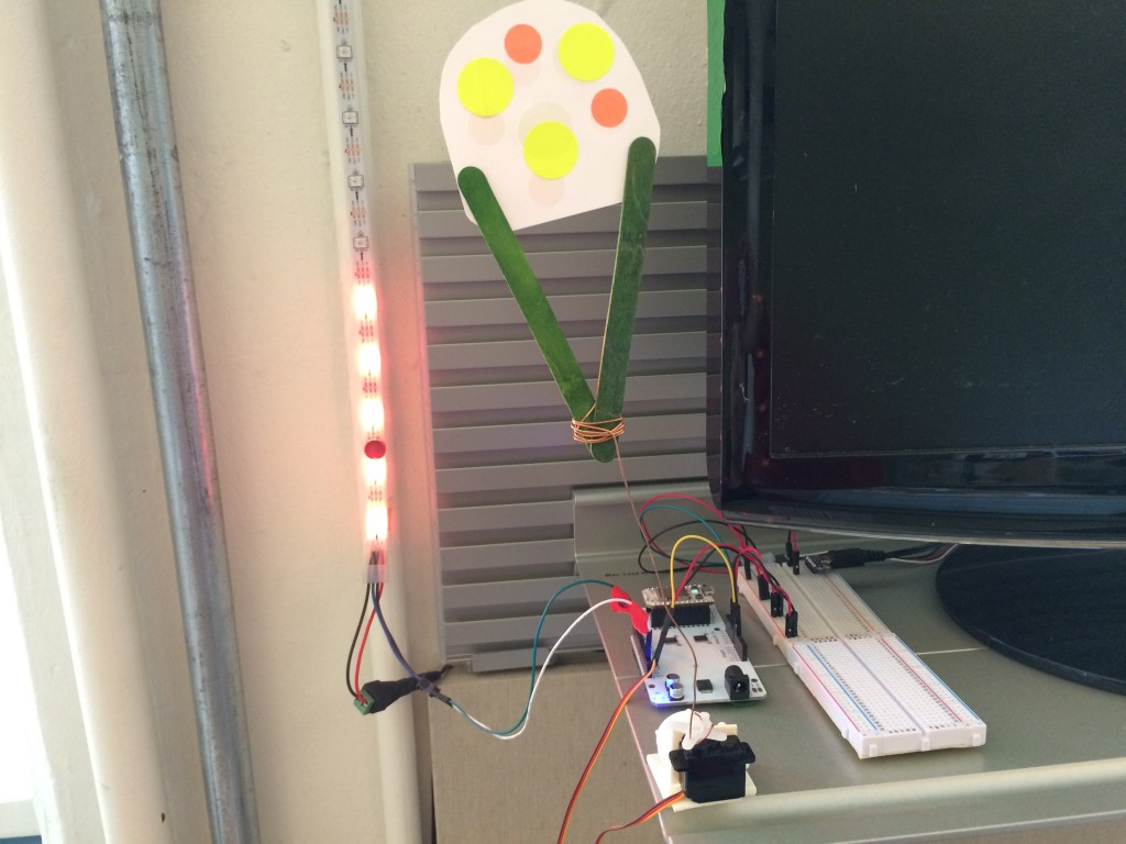
At 3:15 each afternoon, WNYC’s Data News Team knows if it’s ice cream weather or not. They built a bot for that. On Tuesday, the team shared their love of ice cream with New Yorkers with the debut of an ice cream finder. The project is one in a new series that comes out every two weeks.
So far, the team has created projects including a Live Subway Agony Index with emoji to indicate wait times between trains and A Field Guide to NYC Subway Cars, which helps riders identify what kind of train they’re riding on. That helps them figure out if they’re on the type of car that’s known for losing AC.
John Keefe, senior editor for data news, said the team’s data project roots started with hurricane evacuation maps created for Hurricane Irene and then Hurricane Sandy.
“This kind of thing brings us a little bit back to those roots,” Keefe said, “And we’re looking to be rolling out several projects. Many of them will be playful. We hope all of them will be useful.”
With the ice cream finder, the team is also experimenting with SMS, giving people the option to text their number and get a text back with the nearest ice cream. The project goes with the spirit of the team, Keefe said, but they also focus on more serious projects with the station’s investigative reporting.
Via email, I asked some members of the Data News Team about their roles, their work and their favorite ice cream flavor.
Keefe has tested the team’s new ice cream finder, by the way, but he doesn’t really need it.
“I’m pretty well aware of where the ice cream is around me,” he said.
Jenny Ye, producer
What’s your role on the Data News Team? I help build our data interactives and work closely with reporters to help them use data analysis in their reporting.
Favorite project or product you’ve worked on? Love both our focus on supporting education coverage with the relaunch of SchoolBook and our NCAA March Madness @NailbiterBot Twitter account.
Favorite data project or product from another site/team/org? ProPublica’s “Segregation Now” series on the resegregation of America’s schools.
Favorite flavor of ice cream? Buko Pandan at Chinatown Ice Cream Factory.
Kat Aaron, reporter
What’s your role on the Data News Team? I find data, FOIL for data, analyze data, and report human-centered radio stories rooted in data.
Favorite project or product you’ve worked on? Last year, we worked on a story about the NYPD failing to inform the press and public about traffic deaths. We tracked down the details about a fatal hit-and-run that never got reported, and found the victim’s family. The story seems to have had an impact on policies regarding crash reporting, which is always satisfying.
Favorite data project or product from another site/team/org? I love the Eyes on Oakland project from the Center for Investigative Reporting, which combines document and data reporting with sustained street outreach in communities intensely affected by surveillance.
Favorite flavor of ice cream? Salted Crack Caramel at Ample Hills, no question. But their strawberry is also incredible.
John Keefe, senior editor
What’s your role on the Data News Team? I help figure out which projects to do, how we do them and how they’ll hit the airwaves and the internets.
Favorite project or product you’ve worked on? Among our most recent projects, I’d say our Live Subway Agony Index, which puts emoji on real-time train data. Since our creation, the collection of interactives we built as Hurricane Sandy approached, and then hit, New York still sticks out as a moment when we were most useful to our community.
Favorite data project or product from another site/team/org? I’m a huge fan of what ProPublica does, and their Surgeon Scorecard is data journalism in its finest form.
Favorite flavor of ice cream? I’m with Kat on the Ample Hills Salted Crack Caramel. So much yum.
Alan Palazzolo, front-end developer
What’s your role on the Data News Team? I help build the interfaces/products as well as data analysis for our work and the newsroom in general.
Favorite project that I’ve worked on? I am relatively new, but my favorite so far has been Subway Agony Index where we process a whole lot of complex data and turn it into simple emojis in hopes to vindicate people’s (possible) agony of riding the subway.
Favorite data project or product from another site/team/org? There’s so many good ones. A recent one I really liked was the NYT 3D Yield Curve. The combination of visuals and narrative, as well as making 3D charts useful is really amazing. Also, they 3D printed the chart.
Favorite flavor of ice cream? It’s so hard to pick a favorite. I am a really big fan of vanilla ice cream swirled with peanut butter.
Noah Veltman, developer
What’s your role on the Data News Team? I do data-driven reporting and build interactive projects and data visualizations.
Favorite project or product you’ve worked on? My sentimental favorite is probably our list poetry of search terms that led people to the WNYC website.
Favorite data project or product from another site/team/org? I love pretty much everything The Upshot does.
Favorite flavor of ice cream? Three Twins cookies and cream.


