 Covering COVID-19 is a daily Poynter briefing of story ideas about the coronavirus and other timely topics for journalists, written by senior faculty Al Tompkins. Sign up here to have it delivered to your inbox every weekday morning.
You may have heard the World Health Organization say something pretty alarming the other day. “People cannot feel safe just because they had the two doses,” WHO official Dr. Mariangela Simao told reporters. “They still need to protect themselves.”
Chevy Levy, director general of the Health Ministry of Israel, told a radio interviewer that 40% to 50% of that country’s new COVID-19 cases were among people who had been vaccinated. And, more concerning, the new cases appear to be related to the highly infectious Delta variant.
We could really get whipped up with worry when we realize that Israel is one of the most highly vaccinated countries in the world. If vaccinated people are getting infected, that is a huge issue. But slow down. What Levy said and what it means are very different.
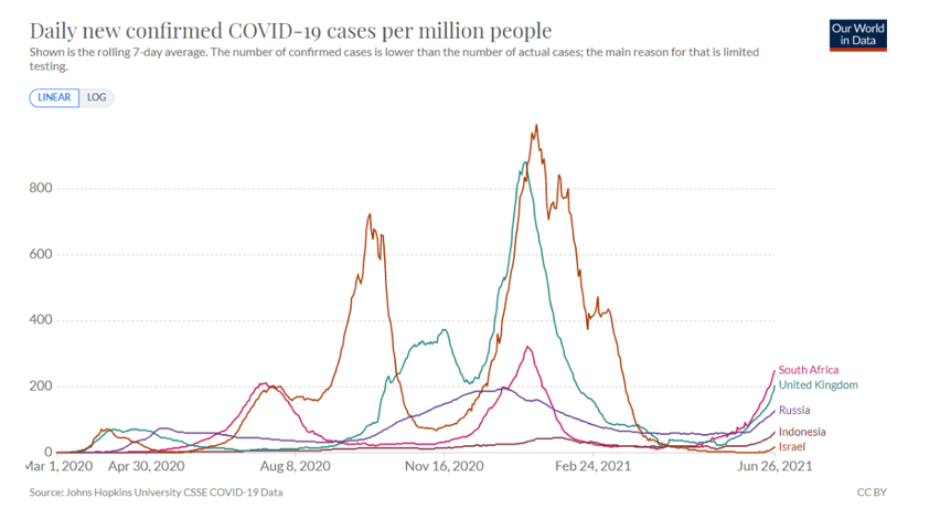
Let’s start with the data, then we will move to the danger of using percentages without raw data. As you can see, Israel has very few overall new cases:
Now let’s turn to epidemiologist Dr. Katelyn Jetelina, who I think is just brilliant at explaining complexities. Jetelina calls this a case of what people in her line of work call “base rate bias.” Let’s zero in on the precise language that Levy used:
He said “half of infected people were vaccinated,” which is very different from “half of vaccinated people were infected.” Jetelina explains the difference, because, she says, this is a misunderstanding that happens all the time:
The more vaccinated a population, the more we’ll hear of the vaccinated getting infected. For example, say there’s a community that’s 100% vaccinated. If there’s transmission, we know breakthrough cases will happen. So, by definition, 100% of outbreak cases will be among the vaccinated. It will just be 100% out of a smaller number.
(Katelyn Jetelina)
Cue Israel. They are one of the global leaders in vaccinations; 85% of Israeli adults are vaccinated. So, say we have the following scenario:
- 100 adult community
- 4 COVID19 cases
- 50% of cases were among the vaccinated
It would look something like this:
(Katelyn Jetelina)
Jetelina suggests four questions that would give us a better understanding of how much we should worry about the new Delta variant cases in Israel:
- What did these outbreaks look like? How many people were at risk? How many people infected? What proportion of the infected were adults vs. kids?
- How were the cases caught? Was there surveillance testing at the schools? In other words, were these asymptomatic cases? If not, what was the severity of the cases?
- What was the severity of the vaccinated cases?
- Were vaccinated cases fully or partially vaccinated? We know 1 dose of vaccines doesn’t work well against Delta.
[the_ad id=”667826″]
Explore vaccine hesitance and acceptance by ZIP code
Using this map of 30,000 ZIP codes compiled by the Institute for Health Metrics and Evaluation, you can see the neighborhoods where vaccines are accepted and rejected. And you will see that there are wide differences from ZIP code to ZIP code.
Researchers found:
The data shows that even within counties where hesitancy overall is low, there are ZIP codes where a much larger proportion of the population is unsure about getting a COVID-19 vaccine. In northeastern Washington state, county-level hesitancy hovers at about 20 percent, but some ZIP codes have hesitancy as high as 50 percent. In almost all states, neighboring ZIP codes show wide n the disparities. In Minnesota, for example, two adjacent ZIP codes have hesitancy of 9 percent and over 60 percent. As county-level officials work to address hesitancy, this ZIP-code-level data will enable more effective geographic targeting.
Some additional key findings from the data:
- Over 1,900 ZIP codes have less than 5 percent hesitancy.
- The median hesitancy among all ZIP codes is 19 percent.
- More than 6,000 ZIP codes have hesitancy above 30 percent.
Isn’t it interesting that Alaska, Texas and North Dakota have some of the lowest and highest hesitancy communities in the nation?
Very different takes on whether canceling extended jobless benefits sends more people back to work
Here is a story that a lot of you are wrestling with since 22 states have canceled or soon will cancel enhanced and extended unemployment payments. The key question is whether there is evidence that canceling the benefits will urge people to return to the workplace.
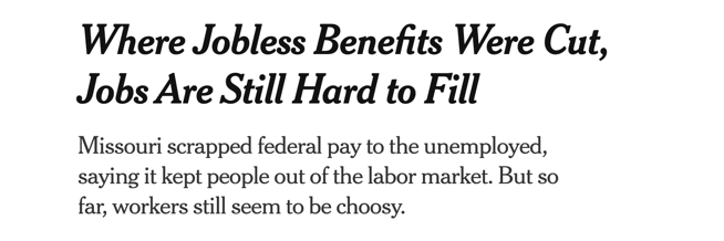
(Screenshot/New York Times)
The Wall Street Journal found:

(Screenshot/Wall Street Journal)
The Times includes this passage:
Why businesses are having such trouble hiring when 9.3 million people were unemployed in May is a puzzle that has generated lots of speculation, but little hard evidence. Many economists are skeptical that enhanced jobless benefits have played an outsize role in the hiring squeeze. They are more likely to point to child care and continuing health fears with less than half the population fully vaccinated. Nor should it be surprising that the nation’s road back from the harrowing limbo of the pandemic, in which millions of jobs vanished and more than 600,000 people have died, is bumpy.
The Journal says:
“You’re starting to see a response to these programs ending,” said Aneta Markowska, Jefferies’ chief financial economist. In recent months “employers were having to compete with the government handing out money, and that makes it very hard to attract workers.”
Other economists and many Democrats say other factors, including lack of child care and fear of Covid-19, are also keeping many potential workers out of the labor force.
[the_ad id=”667872″]
The weather makes news. The climate change causing it, not so much.
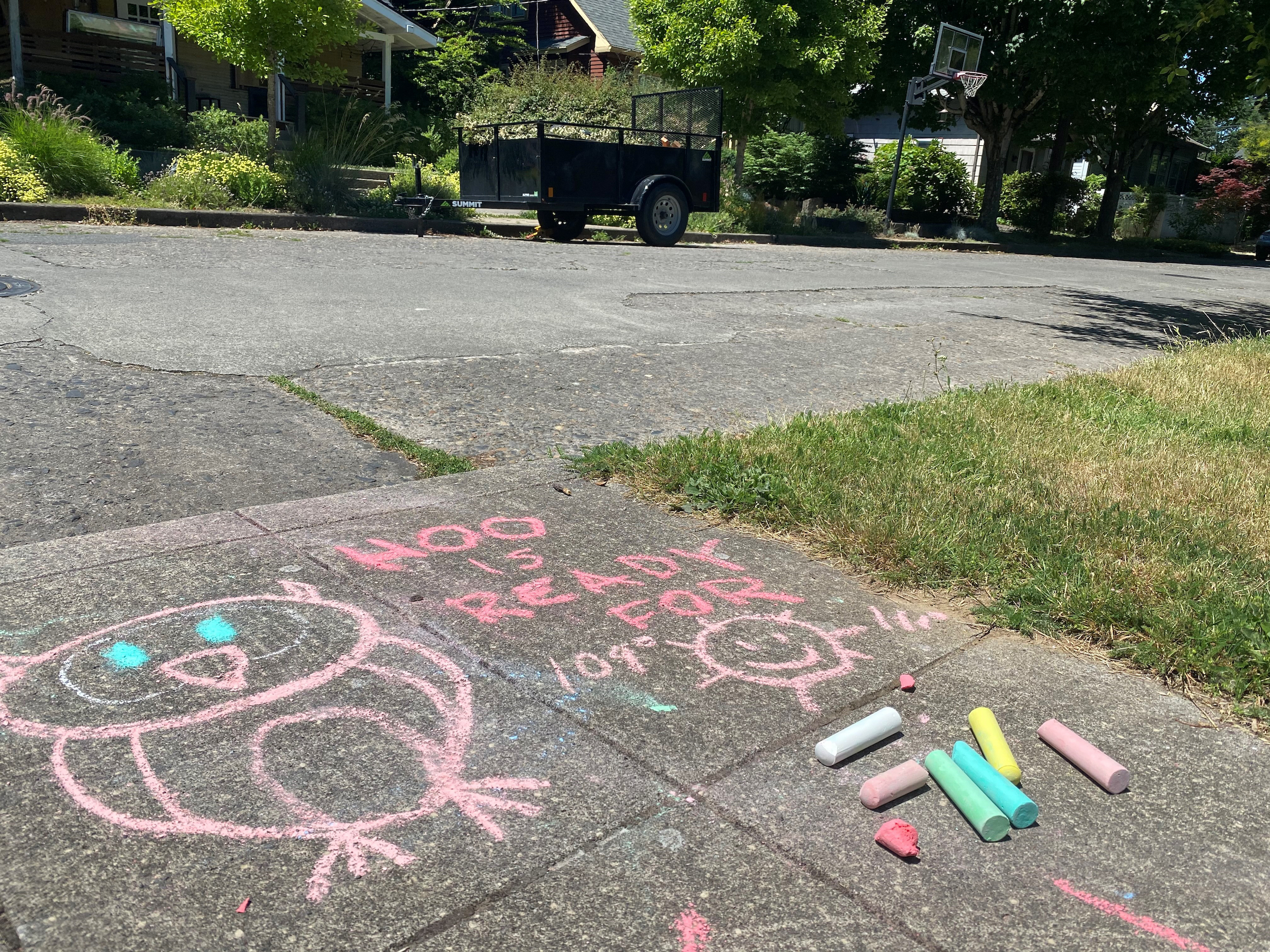
A chalk drawing on the sidewalk in a residential neighborhood in Southeast Portland, Ore., Friday, June 25, 2021, represents a funny take on how hot the temperature is supposed to be during the weekend. The Pacific Northwest sweltered Friday as a historic heat wave hit Washington and Oregon, with temperatures in many areas expected to top out 25 to 30 degrees above normal in the coming days. (AP Photo/Sara Cline)
When you think of heat waves, Portland, Oregon, does not leap to mind. The temperatures there are usually so moderate that a lot of people do not have air conditioning. But this week, Portland temperatures spiked to a high of 108 degrees, the sort of temperature that meteorologists say is a one-in-a-thousand-year event. At least, they hope so.
Climatologist Brian Brettschneider pulled together this data map, which shows you how rare these temperatures are for the Northwest:
And, Brettschneider points out, the usual warmest months are still ahead:
The heat dome over the Northwest, which is a sprawling, intense area of high pressure aloft, causes air to sink, or compress. As it does so, the air temperatures increase. Winds blowing from land to sea around this high are pushing temperatures higher.
Studies have shown that severe heat events such as this one are now on average about 3°F to 5°F hotter than they would be without the many decades of greenhouse gas emissions.
However, climate scientists tell Axios this actually understates climate change’s influence, since warming is also altering weather patterns in ways that makes strong heat domes more common and prolonged.
Daniel Swain, a climate researcher at UCLA, told Axios that the mean warming in the region is “more likely a floor than a ceiling,” given climate change’s potential effects on atmospheric circulation, soil moisture, and other conditions that can amplify extreme heat.
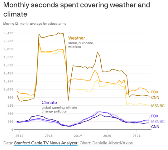
I have been interested to see how many newscasts have opened with stories of severe weather but failed to cover the underlying climate change. It still gets far less coverage, flowing upward around midterms and presidential elections.
Look at this Axios chart:
At the same time, the tropics are doing what they usually do: A couple of tropical waves are cooking.
[the_ad id=”667878″]
We’ll be back tomorrow with a new edition of Covering COVID-19. Are you subscribed? Sign up here to get it delivered right to your inbox.


