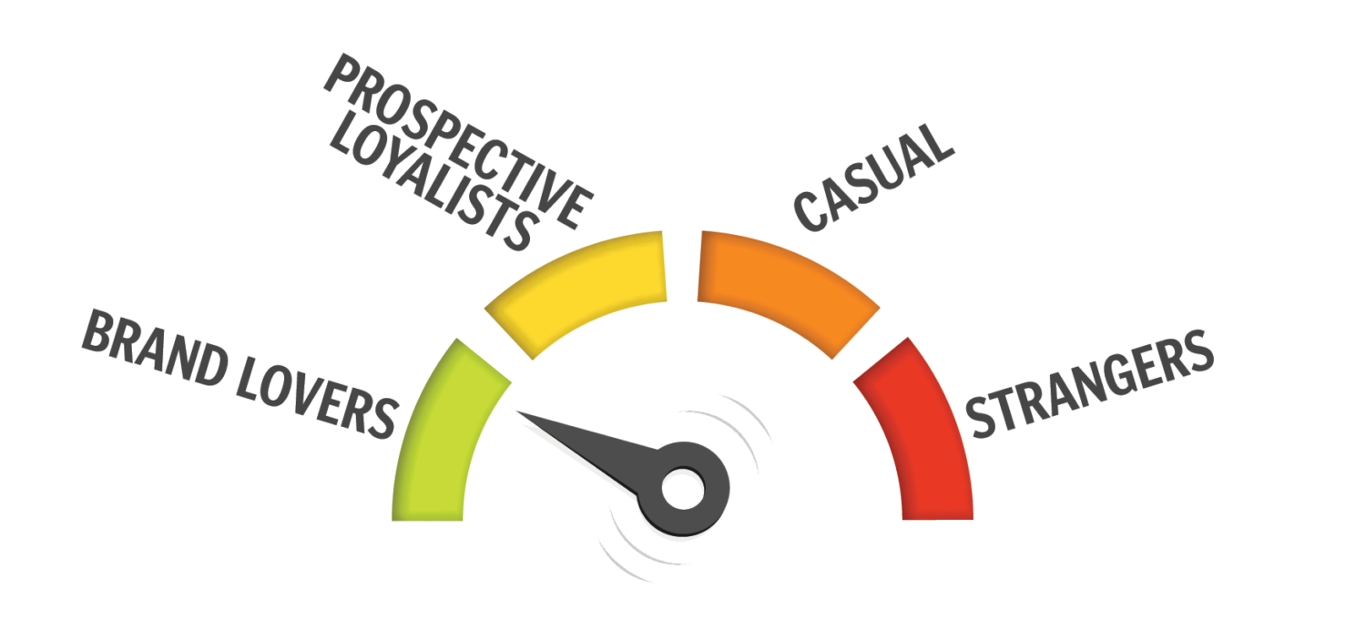
The clicks they are a-changin’. Many news organizations finally seem to be peeling their eyeballs away from pageviews as a reliable metric for success in favor of something more meaningful.
Call it loyalty. Call it habit. Pull out a funnel. Do whatever you want — just know that we need to lock on our analytics to the people who willfully return to our work.
Loyal audiences are good for the impact of our journalism and for our ability to earn revenue from it.
As someone who formally tracks top-performing articles every week and informally pokes and prods at metrics for meaningful insights (like the fact that you folks love to visit articles about AP Style changes from five years ago), I’ve often wondered the best way to measure loyalty. There’s no one single metric that tells you how loyal, or habitual, or whatever, your audience is.
I’ve heard tell of ways to gather reports in Google Analytics, or methods of rendering data through formulas in, shudder, spreadsheets. But who in a small or medium news organization has time for that?
Enter: The Center for Cooperative Media and its game-changing (really) audience explorer dashboard. This thing plugs into Google Analytics and, in minutes, splits audiences into “Brand Lovers,” “Prospective Loyalists” and “Casual,” providing meaningful numbers for each. With the loyalty mystery solved, all that’s left for you is to inspect that data and decide how to move people from one column to the other.
The audience explorer is free and easy to set up (as long as you have admin access to Google Analytics and can follow a set of directions that are no more complicated than an IKEA bookshelf), and findings are clear enough for those of us without post-doctorates in data science.
PICTURE THIS: I subscribe to the theory that the best camera is the one you have with you. For a lot of us, even reporters, that’s the one that’s in our phones. I’ve grudgingly come to love the camera in my iPhone XS after shattering my trusty three-year-old 6S Plus last month. But, like most stock phone apps, it ain’t perfect. Here are a couple of better options for both major phone platforms.
- iOS: Unlike the stock camera app, in which depth of field adjustments work best only with human faces, Halide works with anything you throw at it. In fact, an eerie grayscale effect can show you exactly what your phone is seeing. Halide also offers more control over exposure and file output type. If that’s not your thing, MacRumors has advice on a few other photo apps worth trying.
- Android: Google does a great job of adding new and experimental features to its Google Camera app. If you’re a DSLR fanatic looking to take a great picture on a DSLR-less day, try Camera FV-5. Looking for something else? Tom’s Guide has a list of the best Android camera apps.
BEHIND THE SCENES: This newsletter is usually full of apps and programs and tools to try, but the truth is that I know a little about a lot of things and a lot about a few things. When testing new tools, I turn to a few reliable sources for second opinions. Some of my favorite sites for vetting new tools are Wirecutter, Tom’s Guide and whatever subreddit most closely relates to the tool’s purpose.
NERDING OOO: My favorite tools are often the ones that solve problems that I didn’t even realize I had. Take out of office messages. I hadn’t thought twice about the fact that it takes me a half hour to write one every time I go somewhere until I saw on Twitter that Melody Kramer and Alex Hollender had built an out of office generator. It creates links to interesting Wikipedia articles, quotes from notable people on Wikipedia, or both. Append a sentence that says when you’ll be back and, boom, an instant and interesting OOO message.
OH, WORD: Some of us struggle with language. My big issue is metaphors. Just ask the many people who have heard me say, “Never punch a gift horse in the mouth,” or “At the risk of beating my own horn.” If you’re like me, search engines can be helpful when querying for the correct way to use words or phrases, and none more so than Ludwig, a linguistic search engine for the English language.
DRESSED UP: The Oscars happen every year. And, every year, the Oscars give out roughly the same awards. After 91 years, you’d imagine writing articles about it all could get a little stale. That’s why USA Today’s augmented reality presentation about the best costumes is so great. They’ve been presented in video. They’ve been presented in photo. But unless you’re Colleen Atwood, you’ve probably never seen Hollywood’s best costumes on your own desk.
SHAMELESS SELF PROMOTION: I’m returning to Poynter’s webinar studio! On April 11, I’ll share Digital Tools to Improve Your Workweek. It’ll include many of the workflow helpers and sanity savers you’ve seen here, but in stunning video form with my in-need-of-sunning face attached. I hope to see you there.


