President Joe Biden’s recent announcement about canceling thousands of dollars of student debt for many borrowers has sparked a national debate about the cost of attending college and making a living.
The claim
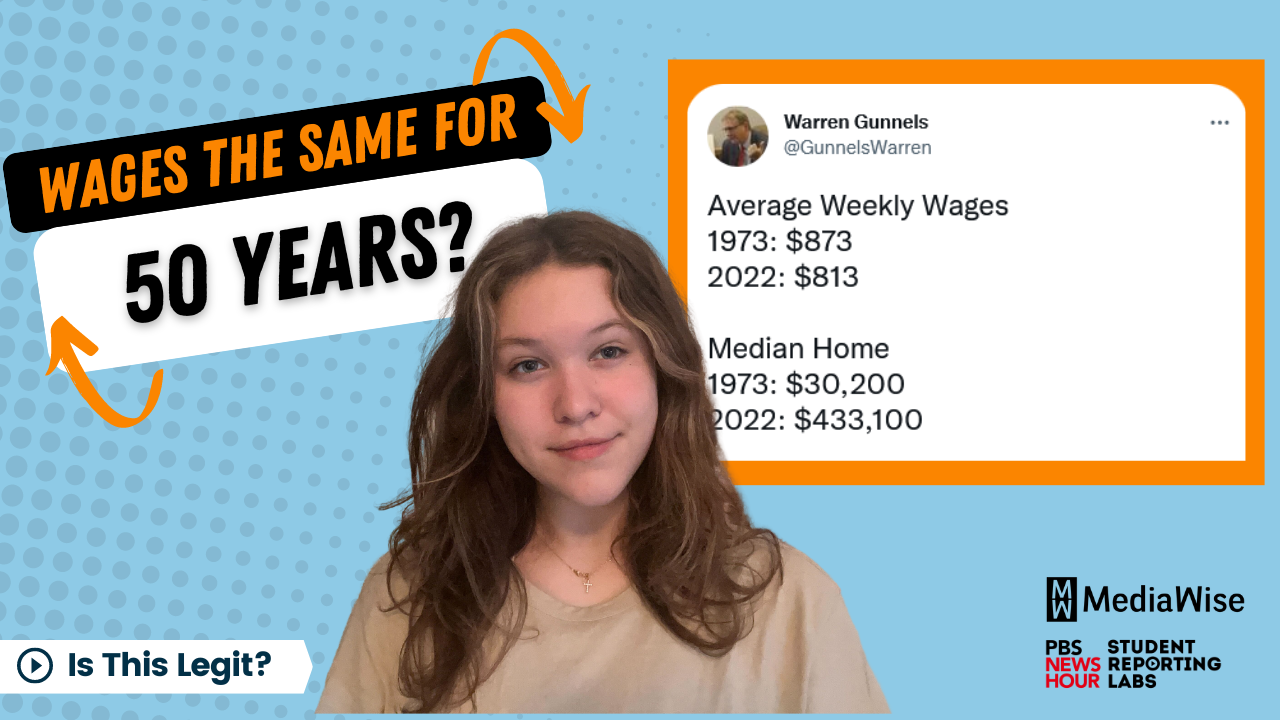
A few days after the August announcement, a senior adviser to Sen. Bernie Sanders posted a now-viral tweet that tried to hit back at people who think students should simply work harder to pay for college.
The tweet had more than 60,000 retweets and 234,000 likes. In it, Warren Gunnels compares the cost of living in 1973 and 2022 in four categories: wages, home prices, rent and tuition at the University of California. The argument being made here is clear: While wages have decreased, the cost of living and going to school has skyrocketed.
But is this data telling an accurate story? Here’s how we fact-checked it.
A healthy dose of skepticism
Let’s start by going back to Gunnels’ initial tweet. First, the tweet doesn’t provide any sources at all, which is a red flag. And if you scroll down, you can see the commenters began demanding some proof, which prompted Gunnels to post a second tweet, this time with links. The sources are pretty legit, including the official University of California website and the U.S. Census Bureau, among other credible websites.
To confirm, let’s check it out. A great media literacy tip is having a healthy dose of skepticism when dealing with claims on the internet that involve a lot of numbers. Remember, just because data is involved doesn’t always mean it’s accurate.
Try reading upstream
There is one glaring issue that jumps out, with the wages. Reading upstream, which means going to the original source the tweet references, I discovered that the wage data comes from the Federal Reserve Bank of St. Louis. However, the tweet actually shows weekly pay that has been adjusted for inflation.
Inflation is when prices increase over time. And in the United States, prices have increased significantly since the 1970s. So, when you compare prices of, say, college or rent now to their cost in the ’70s, you have to adjust for inflation.
A closer look at Gunnels’ tweet shows that while average pay was adjusted for inflation, nothing else in his tweet was. That means the cost of a house or college will seem way cheaper in the 1970s compared to today, and weekly wages will seem higher than they are now. In fact, according to the U.S. Department of Labor, the average weekly wage in 1973, without adjusting for inflation, was around $130, eight times smaller than the tweet claims. That means wages have steadily climbed, not fallen, for the past 50 years.
Later, Gunnels posted a third tweet, but there are some problems here as well. He gets rid of the rent category entirely, and although he adjusts the home prices and tuition for inflation, he now uses only minimum wage.
That’s a lot different than his first tweet, which talked about average wages. According to the Bureau of Labor Statistics 1.6 million workers, or just 1.9% of all workers, earned wages at or below the federal minimum wage in 2019.
Sometimes numbers lie
So, while it’s true that college tuition and home prices have exploded, the data in Gunnels’ tweet is misrepresented. While this may or may not have been intentional, the message is clouded. Even worse, anyone who retweeted the original or didn’t follow along with the comments probably had no idea that some of the data is distorted.
This is all to say that sometimes numbers can lie. If someone uses numbers but doesn’t cite their sources, the figures might be totally false. Or if someone uses numbers but doesn’t provide the full context, they might be comparing apples to oranges -—which is exactly what happened here.
Rating
Not Legit. To debunk this claim, we practiced some quick media literacy tips, such as always having a healthy dose of skepticism — especially when numbers are involved — and reading upstream, meaning going to the original source.
ATTENTION TEACHERS: This fact-check is featured in a free, one-hour lesson plan about how statistics can mislead, with tips to help students avoid sketchy data. “Statistically speaking, statistics are misleading” is available through PBS NewsHour Classroom, and includes slides and a handout, among other resources for teachers.


